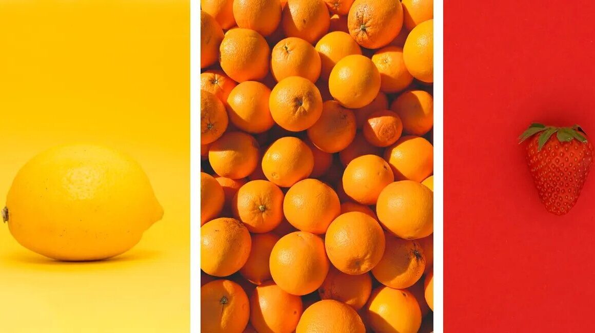
Color palette selection in photography is one of the easiest ways to make your images look more intentional, clean, and professional.
Even when composition and sharpness are correct, messy colors can distract the viewer and weaken the story. When you choose a clear palette, your photos instantly feel more stylish, more emotional, and more consistent across a full set.
In this guide, you will learn how color palette selection in photography affects mood, how to use simple color theory in real shoots, how light changes your palette, and how to keep a cohesive look during editing without making images look artificial.
Why Color Choices Matter: Mood, Style, And Visual Storytelling
Color is not just decoration, it is communication. Warm tones often feel welcoming, energetic, and nostalgic, while cool tones can feel calm, modern, and minimal.
This is why color palette selection in photography directly shapes how viewers feel when they look at your image.
A street portrait can feel cinematic with warm highlights and cool shadows, while a nature photo can feel peaceful using soft greens and neutral tones. Your palette also defines your visual identity.
Many photographers develop a signature look simply by repeating similar color combinations. If you keep consistent tones in portraits, travel shoots, or product photos, your style becomes recognizable.
Over time, that consistency makes your portfolio feel more premium and more “designed” instead of random. Color can also improve subject clarity.
If the background and clothing share similar tones, your subject blends in. But when the palette creates separation, such as warm skin tones against a cooler background, the subject becomes the focus naturally.
This is one of the most practical benefits of color palette selection in photography because it helps you guide attention even without heavy blur or dramatic lighting.
Color Palette Selection In Photography Basics: Complementary Vs Analogous Colors
You do not need advanced theory to build strong palettes. The best color palette selection in photography often comes from simple color relationships like complementary and analogous colors.
Complementary colors sit opposite each other on the color wheel, such as blue and orange or red and green. These combinations create strong contrast and visual energy, which makes photos feel bold and dynamic.
That is why blue and orange is so popular in portrait and travel photography, because skin tones naturally lean warm while backgrounds can lean cooler.
Analogous colors sit next to each other on the color wheel, like blue, teal, and green or orange, red, and yellow. These palettes feel smoother and calmer, which is perfect for soft portraits, lifestyle content, and nature scenes.
Analogous palettes are also safer for beginners because they reduce the risk of clashing colors. A third useful method is keeping things minimal with two dominant colors plus neutrals.
For example, beige and green for a clean lifestyle look, black and red for dramatic street photos, or white and blue for modern travel shots.
Limiting the palette helps your photos look more controlled, which is the goal of color palette selection in photography. Also remember that neutrals are part of the palette too.
White, black, gray, brown, and skin tones help balance bright colors. If everything is colorful, the image can feel chaotic. A few neutrals create space for the main tones to stand out.
Light Changes Everything: Golden Hour, Shade, And Artificial Lighting Effects
Light has a huge impact on color. You can choose the perfect outfit and background, but the final palette will still depend on the lighting conditions.
This is why color palette selection in photography should always include planning for time of day and environment. Golden hour light is warm and soft. It pushes colors toward orange and gold, improves skin tones, and reduces harsh contrast.
If you want emotional portraits, cinematic travel photos, or cozy lifestyle images, golden hour is the easiest option. Shade creates a cooler look and more balanced exposure.
It is ideal for clean portraits and consistent skin tones, especially when the sun is strong. Open shade also prevents harsh shadows on faces, which makes it easier to keep your palette calm and professional.
Midday sun increases contrast and makes colors look louder. Bright highlights and deep shadows can create messy tones, especially in outdoor scenes with many colors.
If you must shoot midday, look for softer light near walls, under trees, or in narrow streets where shadows are not too aggressive. Artificial lighting can create unexpected color shifts.
Indoor bulbs may be warm, fluorescent lights can look green, and mixed lighting often causes uneven tones across the frame. Street lights at night add strong yellow or orange color casts.
To keep color palette selection in photography under control indoors, try to simplify light sources, or use one consistent light temperature when possible. Weather also matters.
Cloudy days reduce contrast and saturation, rain makes colors deeper and adds reflections, while fog creates a muted cinematic feel. These conditions can actually improve your palette if you use them intentionally.
Color Palette Selection In Photography Workflow: References, Planning, And On-Location Decisions
A repeatable workflow makes your palette stronger and saves editing time. The best color palette selection in photography starts before you press the shutter.
Begin with reference images. Collect a small mood board of photos that match your desired style. Look at the dominant colors and the overall feeling. Is it warm and earthy, or cool and modern? Is it colorful or muted?
Once you see the pattern, your palette decisions become clearer. Then plan your key elements: clothing colors, props, and backgrounds. For example, if you want an earthy palette, you can choose beige, brown, olive, and warm neutrals.
If you want a bold urban look, you can use black and one bright accent color. Even small details like a scarf, bag, or drink cup can affect the palette. On location, simplify the frame.
Many palette problems happen because the background includes random objects and bright distractions. Move slightly, change angle, or use a cleaner wall or less colorful area. If the scene feels chaotic, your photo will too.
This is why controlling the background is a major part of color palette selection in photography. A useful trick is to find a “color anchor.”
This is one strong element that guides the palette, like a red jacket in a neutral street scene or a teal door behind a warm portrait. The anchor creates focus and makes the scene feel intentional.
Also think about layering. Foreground, subject, and background colors should support each other. If the foreground is too colorful, it can overpower the subject. But if it is neutral, it can frame the image and strengthen the main tones.
Editing For Consistency: White Balance, HSL, And Keeping A Cohesive Look
Editing is where you lock your palette into a consistent style. The goal is not to make colors unrealistic, but to make them more controlled and emotionally clear.
Good color palette selection in photography editing looks clean and natural. Start with white balance. If your photo is too warm, it can look yellow and dirty. If it is too cool, it can look lifeless.
Adjust temperature and tint until neutrals look clean and skin tones look believable. Then control saturation carefully. Boosting saturation too much often creates fake-looking colors. Instead, use small adjustments and focus on building a hierarchy.
One or two colors should dominate, while the others stay softer. HSL adjustments are powerful because they let you refine specific colors. You can reduce overly bright greens, soften harsh yellows, or clean up blues without affecting skin tones.
This is one of the fastest ways to improve color palette selection in photography because it targets the exact tones that break harmony. To stay consistent across multiple photos, match contrast and color balance from one image to the next.
If one photo is warm and soft but another is cool and contrasty, the set will look disconnected. Keep your tone curve and color direction similar so your portfolio feels unified. Finally, avoid relying on heavy filters.
Presets can help as a starting point, but every light condition is different. The same preset can look great at sunset but terrible in shade. Always adjust white balance and HSL so the palette stays controlled and professional.
See you in the next post,
Anil UZUN

