Achieving color harmony in photography is one of the most powerful ways to evoke emotion, direct attention, and create visual balance in your images.
Colors have the ability to tell stories, shape moods, and define the character of a photograph. When colors are thoughtfully combined they draw the viewer’s eye and make the composition feel intentional and cohesive.
Mastering color harmony allows photographers to not only capture reality but also convey artistic emotion through tone and composition.
In essence, color harmony in photography blends the principles of art and science. It requires an understanding of how tones, contrasts, and lighting interact to influence the overall mood of an image.
Whether shooting portraits, landscapes, or urban scenes, recognizing the emotional and aesthetic impact of colors helps photographers transform an ordinary image into something extraordinary.
Color Harmony In Photography And The Importance Of Tone Balance
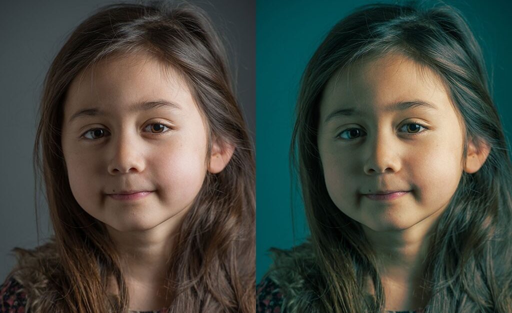
Tone balance is the foundation of color harmony in photography. It involves managing the brightness, saturation, and contrast levels to ensure colors complement one another instead of competing.
A well-balanced tone creates unity within an image, guiding the viewer’s eyes naturally across the frame. Warm tones such as reds, oranges, and yellows convey passion, warmth, and energy.
Cool tones like blues and greens evoke calmness, serenity, and distance. Striking the right balance between these color groups determines how your photograph feels.
For example, combining warm sunlight with cool shadows can create depth and atmosphere in outdoor photography.
In post-production, tone balance can be fine-tuned using editing software like Adobe Lightroom or Capture One. Adjustments to highlights, midtones, and shadows allow for precise control over the emotional tone of the photo.
When balanced effectively, colors enhance the narrative rather than distract from it, making tone management a vital part of achieving professional-level color harmony in photography.
Creating Visual Impact Through Contrast And Lighting
Contrast and lighting are inseparable when discussing color harmony in photography. The way light interacts with colors can either enhance or diminish their impact.
Proper use of contrast makes colors pop while maintaining cohesion. High contrast can emphasize energy and drama, while low contrast produces soft, romantic, or nostalgic moods.
Lighting conditions also play a major role in how colors appear. The golden hour, when sunlight is softer and warmer, enhances natural color harmony by creating gentle transitions between tones.
Midday sunlight, on the other hand, introduces harsh shadows and strong color separation, which can either strengthen or weaken the image depending on your creative goal.
Artificial lighting provides flexibility in controlling the mood of a scene. Using gels, diffusers, or colored lights can dramatically change the way colors interact.
However, balance is crucial too much artificial color manipulation can make an image look forced. Understanding how light and contrast shape perception helps photographers achieve the perfect balance for color harmony in photography.
Color Harmony In Photography Using The Color Wheel Effectively
The color wheel is an indispensable tool for mastering color harmony in photography. It illustrates how primary (red, blue, yellow), secondary (green, orange, purple), and complementary colors relate to one another.
Using it effectively allows photographers to plan color combinations that either blend seamlessly or provide eye-catching contrast.
Complementary colors such as blue and orange or red and green sit opposite each other on the color wheel and create striking, dynamic compositions.
Analogous colors, which are next to each other (like blue, turquoise, and green), produce a softer, more cohesive aesthetic. Meanwhile, monochromatic color schemes use variations of a single hue to create minimal yet emotionally powerful images.
When editing, applying color theory consciously can bring harmony to an otherwise chaotic frame. Subtle adjustments in hue and saturation based on the color wheel help ensure that each tone supports the visual flow of the photograph.
In short, mastering the color wheel transforms technical understanding into artistic expression, enhancing color harmony in photography in every shot.
How Natural And Artificial Light Affect Color Composition

Light is the most decisive factor in color harmony in photography. The quality, direction, and temperature of light influence how colors appear and interact.
Natural light tends to bring out soft, authentic tones, while artificial light can either complement or distort colors depending on its intensity and source.
During sunrise and sunset, known as the “golden hours,” the sunlight casts warm hues that enrich color harmony naturally. In contrast, the midday sun introduces cooler tones with higher contrast, suitable for vibrant and bold compositions.
Photographers who understand these light variations can adjust exposure and white balance to maintain realistic yet impactful color relationships. Artificial lighting introduces another layer of creativity.
Tungsten lights create warm orange tones, while fluorescent and LED lighting can produce cooler or mixed color effects. Proper white balance adjustments ensure these variations remain controlled rather than overwhelming.
When used deliberately, both natural and artificial lighting can enhance color harmony in photography, creating depth, emotion, and consistency across the image.
Color Harmony In Photography For Telling Strong Visual Stories
Beyond technical mastery, color harmony in photography serves as a storytelling tool. Each color conveys a unique emotion red symbolizes intensity, yellow radiates happiness, blue represents calm, and green evokes growth or nature.
The harmony between these hues can emphasize the mood, theme, or narrative of a photograph.
For example, a portrait with warm golden tones may convey intimacy and comfort, while a street photo with cooler blue-gray shades can express solitude or mystery. Photographers use color intentionally to evoke feelings without relying on words.
The key is subtlety too much saturation or poor balance can break the emotional rhythm of the image. By understanding how color harmony supports visual storytelling, photographers can craft more compelling compositions.
Each hue becomes part of the narrative structure, helping guide the viewer’s emotional response. In this way, color harmony in photography is not just about aesthetics it’s about communication through art.
See you in the next post,
Anil UZUN