Understanding color theory in photography is one of the most powerful ways to elevate your compositions and tell more impactful visual stories. Colors influence how viewers perceive and feel about your photos.
When used deliberately, they can guide the eye, evoke emotion, and bring balance to your images. Ignoring color, on the other hand, can make even the most technically sound photo feel chaotic or lifeless.
At its core, color theory in photography is about learning how colors interact with each other and how they can be used to create harmony, contrast, or emphasis.
It’s not just about what’s in the frame—it’s about how the colors within the frame relate to each other and affect the overall perception of the photo.
Whether you’re shooting in natural light or studio settings, whether you’re capturing urban scenes or natural landscapes, having a solid grasp of color principles allows you to make intentional choices, rather than just reacting to what’s in front of you.
This guide explores the foundations and practical applications of color theory in photography, providing insights and exercises to help you start creating more compelling, color-conscious work.
Color Theory In Photography: Why It Matters In Visual Storytelling
Colors are far more than just visual elements—they are storytelling devices. Color theory in photography teaches us how to use color to guide a viewer’s mood and focus.
Think about the emotional difference between a warm-toned sunset photo and a cool, misty forest scene. Each triggers a unique psychological reaction based largely on color.
Warm colors—reds, oranges, and yellows—are often associated with energy, passion, or warmth. These colors naturally draw attention and are perfect for emphasizing key elements in your frame.
Cool colors like blues, purples, and greens convey calmness, serenity, or sadness. They tend to recede in a composition, creating a sense of space or isolation.
Understanding how different hues impact viewer emotions allows photographers to communicate more clearly.
A portrait in soft, pastel tones might feel romantic or nostalgic, while one dominated by stark contrasts and deep blues might feel more dramatic or intense.
Also important is the use of color to create visual structure. Color repetition can establish rhythm, while contrast between complementary colors can make subjects pop from the background. These are essential storytelling tools within color theory in photography.
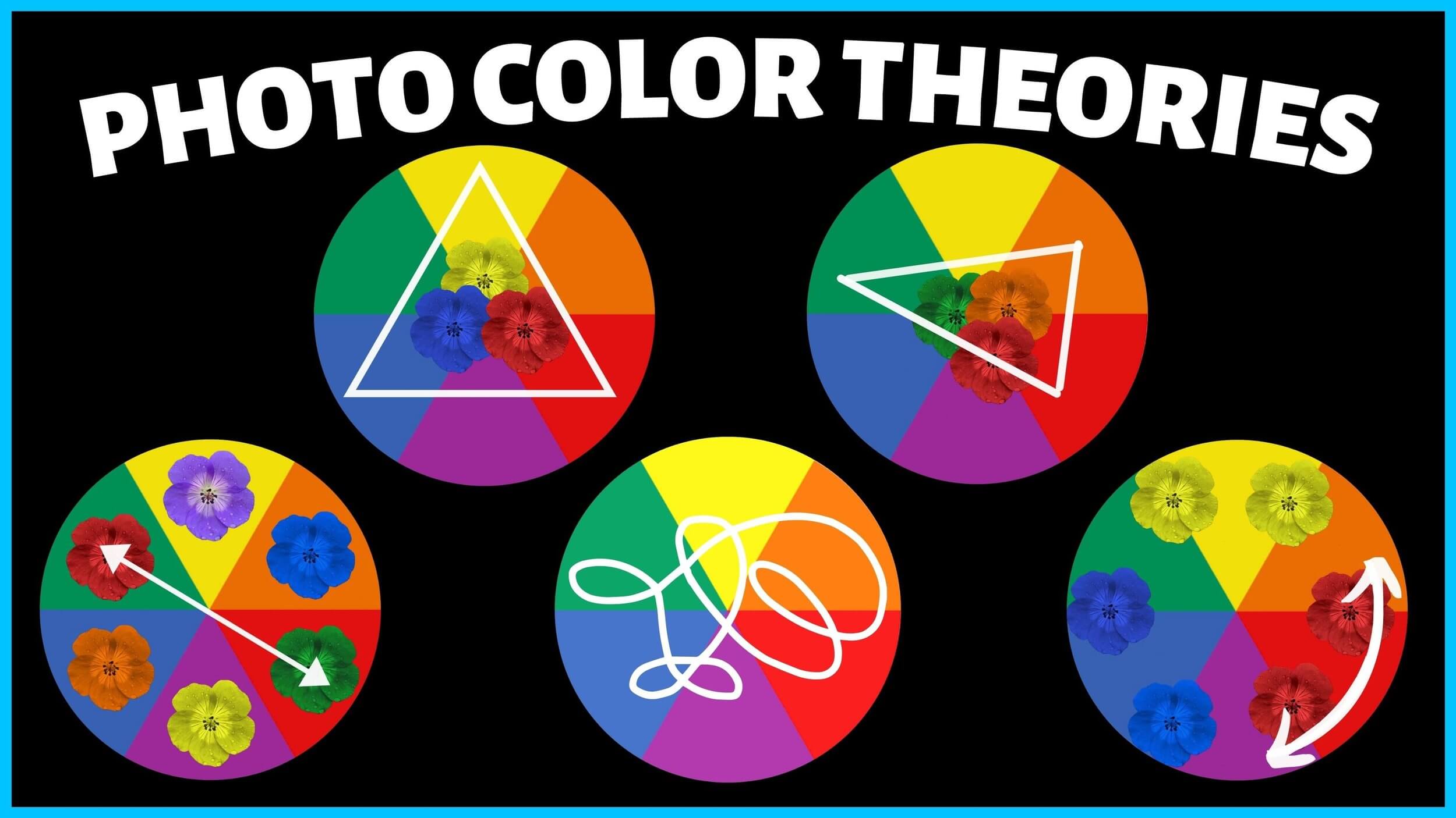
Understanding Primary, Secondary, And Complementary Colors
One of the key components of color theory in photography is learning how the color wheel is structured.
At the most basic level, you have primary colors—red, blue, and yellow. These can be combined to create secondary colors like green, orange, and purple. Then there are tertiary colors, created by mixing primary and secondary colors.
Complementary colors are located opposite each other on the color wheel—for example, red and green, blue and orange, or yellow and purple.
When used together in a photograph, these combinations create high visual contrast and can make images more dynamic.
Analogous colors, which sit next to each other on the color wheel (such as blue, blue-green, and green), offer a more harmonious and calming feel.
These are ideal for creating a smooth, consistent atmosphere, especially in nature photography or minimalist compositions.
Triadic color schemes—those that use three evenly spaced colors on the wheel—can produce balanced yet vibrant images. Mastering these relationships is crucial to using color theory in photography effectively.
Additionally, understanding warm versus cool tones helps with foreground-background separation and guiding the viewer’s attention. Warm colors tend to advance in an image, while cool colors recede.
Color Theory In Photography: How To Evoke Emotion Through Hue
Photographers who grasp color theory in photography can evoke specific emotions through intentional color choices. Every color carries a psychological weight that impacts how an image is received, often at a subconscious level.
Red, for example, can suggest passion, urgency, or danger. It’s a bold color that instantly commands attention.
Yellow feels cheerful and bright, often associated with sunlight and optimism. Blue evokes trust, stability, and melancholy, depending on its intensity and placement in the image.
Green is associated with growth and nature, making it a calming and peaceful choice for outdoor shots. Purple tends to feel luxurious or mysterious. Understanding these emotional triggers lets you create more deliberate, story-driven images.
For example, if you’re shooting a dramatic portrait, introducing deep shadows and cool tones can create a somber or introspective mood. On the other hand, high-key lighting and pastel tones might convey innocence or joy.
Color grading in post-production also plays a major role. By adjusting hue, saturation, and luminance, you can shift the emotional tone of your photo dramatically. This creative control is an essential part of applying color theory in photography to your workflow.
Balancing Light, Contrast, And Color For Better Shots
Light, contrast, and color are deeply interconnected. Applying color theory in photography effectively means understanding how these elements work together to create visual balance and impact.
The time of day you shoot significantly affects color temperature. Golden hour light, for instance, brings out warm, saturated tones—ideal for romantic or serene images.
Midday light tends to be harsher, washing out colors and creating strong shadows, which can work for gritty or high-contrast styles.
Backlighting can amplify colors by increasing translucency, especially in elements like flowers or fabrics. Side lighting emphasizes texture and form, adding depth to color transitions.
Contrast is not only about light and dark—it’s also about color contrast. High contrast between complementary colors can add energy and tension to a photo, while low contrast between analogous colors promotes unity and calmness.
When editing, pay attention to white balance and color grading. A slight shift in temperature can turn an image from cold and clinical to warm and inviting.
This nuanced control is a core part of mastering color theory in photography and ensures your final image matches your creative intent.
Color Theory In Photography: Exercises To Practice In The Field
Practicing color theory in photography doesn’t require expensive gear—just observation, intention, and creativity. These simple field exercises will help you develop your eye for color and composition.
First, try creating a monochromatic series. Pick one color (like red) and shoot a series of images where that color dominates the frame. This trains you to notice tone variation and how a single hue can carry emotion or focus.
Next, do a complementary color walk. Take your camera out and specifically look for pairs like orange and blue or green and red. These exercises help you understand how opposing colors can work together to create tension and visual interest.
Shoot the same subject at different times of day. Observe how changing light affects the color temperature and overall mood of the image. This enhances your understanding of how light and color interact in real-world settings.
You can also limit yourself to an analogous color palette. Photograph only scenes where neighboring colors on the wheel appear together. These images often feel harmonious and soothing, and help you recognize color transitions more easily.
Post-processing challenges are just as helpful. Import a neutral shot and experiment with different color grading options. Try creating a cinematic look using teal and orange, or evoke nostalgia with desaturated, warm tones.
Each of these exercises is designed to strengthen your practical understanding of color theory in photography and give you the tools to make intentional, expressive color choices in your work.
See you in the next post,
Anil UZUN